I'm Not Dead…Yet
Jan. 8th, 2011 11:29 amAnd I am getting better.
I had a bit of a tickle in the back of my throat on Wednesday. By the time I went to bed, I was feeling pretty bad. By Thursday morning I had a fever, radical hot and cold flashes, and painful coughing fits, which continued throughout Friday. At about 5pm on Friday, my fever broke, but the aches and coughing persist through to the present. Not fun.
While I was down for the count, the Mac App Store came out. Aside from a few applications that existed prior to the store which follow the basic tenets of Apple's Human Interface Guidelines (HIG), most of the apps on offer are a total shit-show. The quality of some apps will improve, I am sure, but the ratio of user interface (UI) abominations to usable software is only going to get uglier. The store is only a couple of days old, and someone has created a website devoted to the horror show:
http://readthefuckinghig.tumblr.com/
Go there, then come back. I'll wait.
Interestingly, this has shown me that writing good software, and creating a strong user experience (UX) is hard work, and that my job as a user experience designer isn't in jeopardy for the next few decades — or is it?
Increasingly, I'm seeing clients who insist on bad ideas, even after showing them examples of why they are bad. At some point, you just cave, and build what they want. After all, they're paying you. On the user side, sure, users like software that's pretty. Anecdotally, it's clear that 'normal' users of software don't care about their user experience, possibly because they've been beaten into submission by decades of bad UX. Some even *crave* bad UX design, as they believe they are 'elite' by mastering a complex, poorly thought out UI (folks on Wall Street are good examples). Those people don't want software to be easy to use, as it's a serious point of job security.
Take a look at the new Twitter for Mac app:
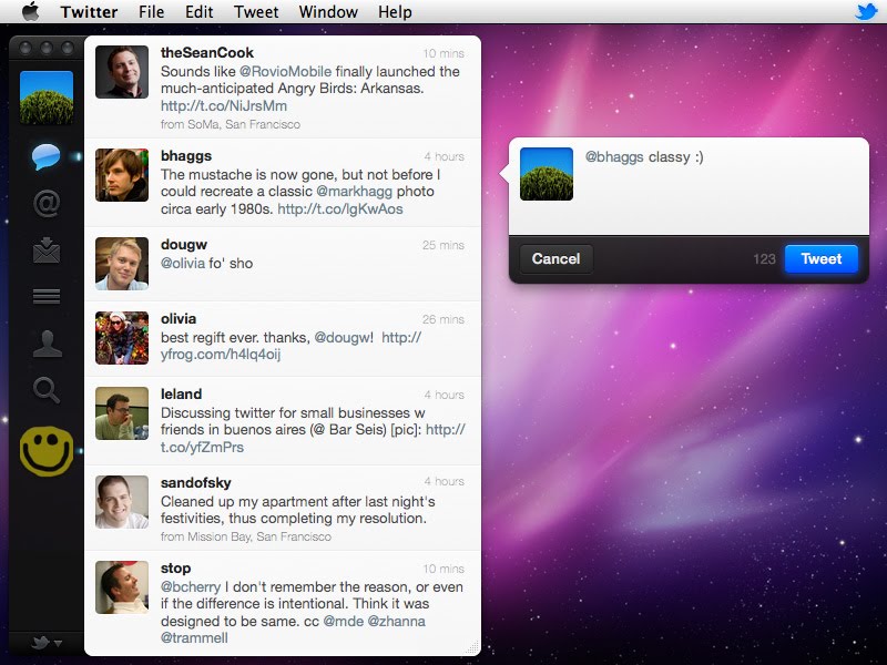
Sure, it's pretty, but what about usability? There is no title bar, so you don't know where to grab to move the window; the standard window controls (the three buttons in the upper left) are non-standard, do not respect your global preference, and look disabled; the other modes (mentions, direct messages, lists, etc) look disabled; there is no button to make a new tweet. Instead, it's a dropdown on the lower left, and you have to choose what you want. That's just the obvious stuff from the main interface. The Preferences Panel is also pretty gacked up:

This breaks one of the main rules of UX Club. The items in your dropdown menu should be what the user has selected. There is no choice of "Menu", and yet, that is what the current selection is. Now why is that? Oh, that's because that dropdown is actually a multiple select list!

Remember kids, every time you use a single selection UI element for multiple selections, god kills a kitten. Please, think of the kittens.
And yet, everyone is gushing over this app. Personally, I ditched it and went back to Tweetie (Tweetie was acquired by Twitter and v2 is rebranded Twitter for Mac). It too has its UI problems, but there are fewer of them. I've also been looking at Kiwi, which I do like, but some of the more advanced features are difficult to use (like easily viewing a conversation, seeing recent tweets by that person, etc).
By now, I'm rambling, and totally lost the point of my post. I blame the martian death flu. Suffice to say, consistency is out the window, in favour of 'cool', defined as slick and new. Will companies bother hiring true UX design professionals, when a visual designer can just make something very pretty (and therefore engaging)?
I had a bit of a tickle in the back of my throat on Wednesday. By the time I went to bed, I was feeling pretty bad. By Thursday morning I had a fever, radical hot and cold flashes, and painful coughing fits, which continued throughout Friday. At about 5pm on Friday, my fever broke, but the aches and coughing persist through to the present. Not fun.
While I was down for the count, the Mac App Store came out. Aside from a few applications that existed prior to the store which follow the basic tenets of Apple's Human Interface Guidelines (HIG), most of the apps on offer are a total shit-show. The quality of some apps will improve, I am sure, but the ratio of user interface (UI) abominations to usable software is only going to get uglier. The store is only a couple of days old, and someone has created a website devoted to the horror show:
http://readthefuckinghig.tumblr.com/
Go there, then come back. I'll wait.
Interestingly, this has shown me that writing good software, and creating a strong user experience (UX) is hard work, and that my job as a user experience designer isn't in jeopardy for the next few decades — or is it?
Increasingly, I'm seeing clients who insist on bad ideas, even after showing them examples of why they are bad. At some point, you just cave, and build what they want. After all, they're paying you. On the user side, sure, users like software that's pretty. Anecdotally, it's clear that 'normal' users of software don't care about their user experience, possibly because they've been beaten into submission by decades of bad UX. Some even *crave* bad UX design, as they believe they are 'elite' by mastering a complex, poorly thought out UI (folks on Wall Street are good examples). Those people don't want software to be easy to use, as it's a serious point of job security.
Take a look at the new Twitter for Mac app:
Sure, it's pretty, but what about usability? There is no title bar, so you don't know where to grab to move the window; the standard window controls (the three buttons in the upper left) are non-standard, do not respect your global preference, and look disabled; the other modes (mentions, direct messages, lists, etc) look disabled; there is no button to make a new tweet. Instead, it's a dropdown on the lower left, and you have to choose what you want. That's just the obvious stuff from the main interface. The Preferences Panel is also pretty gacked up:
This breaks one of the main rules of UX Club. The items in your dropdown menu should be what the user has selected. There is no choice of "Menu", and yet, that is what the current selection is. Now why is that? Oh, that's because that dropdown is actually a multiple select list!
Remember kids, every time you use a single selection UI element for multiple selections, god kills a kitten. Please, think of the kittens.
And yet, everyone is gushing over this app. Personally, I ditched it and went back to Tweetie (Tweetie was acquired by Twitter and v2 is rebranded Twitter for Mac). It too has its UI problems, but there are fewer of them. I've also been looking at Kiwi, which I do like, but some of the more advanced features are difficult to use (like easily viewing a conversation, seeing recent tweets by that person, etc).
By now, I'm rambling, and totally lost the point of my post. I blame the martian death flu. Suffice to say, consistency is out the window, in favour of 'cool', defined as slick and new. Will companies bother hiring true UX design professionals, when a visual designer can just make something very pretty (and therefore engaging)?